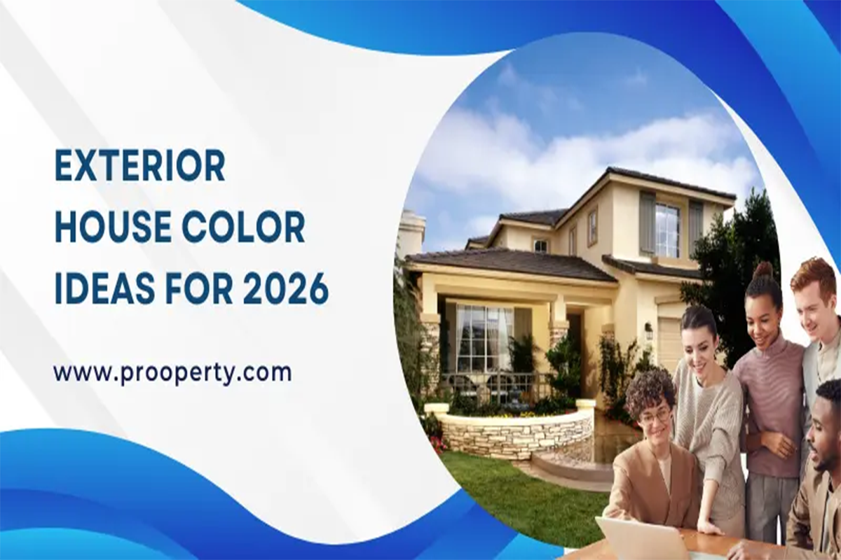
The colour of a house is more than just a visual thing - it sets the tone for what's to come inside for anyone who glances at it. And for 2026, exterior colour trends are all about striking a balance. Homeowners want a house that looks modern and not like a passing fad, something that feels as if it's been around for years already. The thing is, they also want colours that'll still look great in ten years’ time - that suit all sorts of architectural styles and are easy to maintain. This guide is here to help you choose an exterior color that really works for your place - whether it's a small bungalow or a sprawling mansion. We'll be looking at colors that'll make your house stand out in the area, without looking out of place. And above all, it's all about finding that perfect balance between looks and long-term satisfaction. When it comes to choosing an exterior colour, it's a good idea to start by observing your house in all different lighting conditions rather than relying on pictures of other people's homes. The way a colour looks can change dramatically as the day goes on - what might look really soft in the morning can look completely different by the afternoon. Try putting up some sample colour swatches on your walls to get a better feel for how they'll look. But it's not all about the colour itself - the surroundings of your house play a big part as well. Things like nearby buildings, fences, gardens and road exposure all affect how your colour will look. A good colour choice will complement its surroundings without overpowering them - it should make your house stand out just a bit, but not too much. Neutral shades are still the way to go for exterior design in 2026 - and with good reason. They tend to stay looking good for years to come, and don't overpower the architectural details of your house. Soft whites, stone greys, light beiges and muted taupes all work well on a wide range of house styles. One of the best things about neutral colors is that they give you a lot of flexibility - you can change your railings, doors, lights and balcony furniture without having to worry about repainting your whole house. And that's a big plus for people who plan on staying in the same house for a long time. Exterior colors can play an important role in highlighting the architectural character of a home, particularly when the design includes spacious outdoor areas and refined details. For readers exploring upscale residential styles and architectural inspiration, Luxury Villas in Gurgaon can offer useful ideas on how exterior finishes, landscaping, and contemporary design elements come together. Warm colours are all about comfort and familiarity - they make a house feel like it's been around for years already. Shades like soft sand, pale terracotta, creamy ivory and light clay are all great choices. These colors look really good in bright sunlight, and work well with landscaping. Warm colours are especially good for houses where the inside and outdoor spaces blend together a lot. When you pair them with wooden textures, stone cladding or matte metal finishes, they create a really welcoming feeling without looking too fussy. For people who love a modern, contemporary look, cool colours are still the way to go. Soft greys, muted blues, sage greens and concrete tones all provide a clean finish without ever feeling cold. These colors work particularly well on houses with really clean lines, flat roofs and minimal detail. The key to getting it right with cool colors is making sure your lighting is on point - soft evening lighting can really help to warm up the overall feel and add some depth to your house. Bold exterior colors in 2026 focus on depth rather than brightness. Deep charcoal, forest green, dark slate, and muted navy add sophistication when applied selectively. These colors work best on accent walls, recessed sections, or structural highlights. Using bold colors across the entire facade can feel overwhelming. Controlled application keeps the design strong without appearing heavy. Balance with lighter secondary shades ensures visual comfort. Different house types respond differently to color selection. Gurgaon Property often benefit from warmer or neutral shades that feel welcoming. Villas allow slightly deeper tones due to open space and landscaping buffers. Smaller houses perform better with lighter colors that reflect light and visually expand the facade. Multi-storey homes require careful contrast planning to avoid a stacked appearance. Understanding the house type helps narrow color choices naturally. 1. Soft Ivory with Charcoal Accents Creates a clean, timeless appearance with subtle contrast. 2. Warm Beige with Stone Grey Trims Balances comfort with structure, ideal for family homes. 3. Light Grey with White Borders Perfect for modern elevations with clean lines. 4. Sand Cream with Wooden Highlights Pairs beautifully with balconies and pergolas. 5. Pale Sage Green with Off-White Calm, natural, and suited for homes near greenery. 6. Taupe with Dark Brown Railings Adds warmth without appearing dated. 7. Muted Blue Grey with Warm Lighting Modern and soothing when paired with warm LEDs. 8. Soft Terracotta with Cream Edges Grounded and culturally versatile. 9. Stone White with Black Metal Elements Sharp contrast that suits urban homes. 10. Warm Grey with Textured Panels Adds depth without heavy color shifts. 11. Dusty Olive with Light Beige Earthy yet contemporary. 12. Off-White with Vertical Wood Cladding Enhances height perception. 13. Light Mushroom Grey with Bronze Accents Elegant and understated. 14. Cool Concrete Grey with White Projections Industrial yet refined. 15. Pale Yellow with Neutral Borders Bright without overpowering. 16. Creamy Taupe with Glass Railings Luxury-focused and modern. 17. Soft Clay with White Window Frames Warm and welcoming. 18. Muted Mint with Stone Highlights Fresh and distinctive. 19. Warm Sandstone with Dark Frames Natural and durable looking. 20. Pearl White with Grey Textures Light-reflective and clean. 21. Slate Blue with Neutral Base Bold yet controlled. 22. Greige with Minimal Black Lines Balanced and adaptable. 23. Light Coffee Brown with Cream Comfortable and familiar. 24. Soft Peach with White Borders Bright but gentle. 25. Pale Green Grey with Stone Natural and elegant. 26. Smoky Grey with Matte Black Modern statement design. 27. Beige White with Terracotta Highlights Blends tradition with modernity. 28. Light Steel Grey with Wood Accents Urban and warm. 29. Muted Sand with Dark Brown Stable and low maintenance. 30. Off-White with Subtle Texture Finish Timeless and versatile. One of the most common mistakes that people make is relying solely on digital images when choosing colors. The thing is, screens can be really misleading when it comes to how colors will actually look in real life. And then there's the issue of ignoring the texture of the surface you're painting - a rough finish can basically suck up light in a way that a smooth one won't. And let's not even get started on overdoing it with dark colors or trying to cram too many shades into one spot at once - it's a guarantee that your finished product is going to look cluttered and overwhelming. But if you plan out your color palette before you start painting, you can avoid all that hassle. The truth is, the color you choose for the outside of your house is going to have a big impact on how much maintenance and upkeep you have to do over the years. Dark colors are going to fade a lot faster under the sun, while super light shades are just going to show every single speck of dust and water spot. The sweet spot is usually somewhere in the middle - a nice neutral color that's not too showy but still looks good. Paint quality, the finish type, and making sure your surface is properly prepared are all just as important as what color you choose. And yes, it may cost a bit more upfront to get your paint just right, but it's so worth it in the long run - you'll be doing a lot less repainting and stressing about your exterior. When it comes to choosing exterior colors, you want to make a choice that's going to feel right for a long, long time - even when the latest trends have come and gone. And let's be real, 2026 is going to be a pretty exciting year for design, but at the end of the day, you need to think about what will actually make you happy, what fits with your environment, and what just plain looks good to you. When all those things come together, it's like your exterior just... feels like it belongs. Exterior colors work best when they complement the architectural form, entrance, windows, balconies, and other visible features of the property. If you are planning to refresh the overall appearance of your home, explore House Front Design and Home Elevation Design for ideas on combining colors, materials, proportions, and architectural details into a cohesive exterior. Frequently Asked Questions How do I choose an exterior house color that will not look outdated? Focus on balance instead of trends alone. Neutral and muted tones age better than loud shades. Choose colors that complement your home’s structure, surroundings, and natural light. When a color supports architecture rather than dominating it, it stays relevant longer. Which exterior color works best in strong sunlight conditions? Mid tone neutrals such as warm grey, beige, or soft sand perform best in strong sunlight. Very light colors may look washed out, while very dark shades can appear harsh. Always test samples on sun-facing walls before finalizing. Are bold exterior colors suitable for residential homes? Yes, but only when used selectively. Bold colors work best as accent elements on feature walls, balconies, or recessed areas. Using them across the entire facade can feel overwhelming and increase maintenance needs. What exterior colors make a small house look bigger? Light and soft shades reflect more light and create a sense of openness. Off-white, pale grey, and light beige visually expand the facade. Avoid heavy contrasts on small homes, as they break visual continuity. How many exterior colors should one house have? Ideally, two to three colors are enough. One primary color, one secondary shade, and one accent create visual balance. Too many colors make the elevation look cluttered and reduce architectural clarity. Does exterior color affect house maintenance cost? Yes. Dark colors fade faster, and very light colors show stains more easily. Balanced neutral shades require less frequent repainting. Paint quality and finish also play a major role in long-term maintenance. Should exterior color match interior design? They do not need to match exactly, but they should feel connected. A harmonious transition between exterior and interior tones creates a more cohesive living experience, especially at entrances and balconies. Are neutral exterior colors boring? Not at all. Neutral colors highlight textures, shadows, and architectural lines better than strong colors. When combined with lighting, materials, and accents, neutrals look sophisticated and modern. Is it better to follow trends or personal preference for exterior color? Personal comfort should come first. Trends help with direction, but you live with the color every day. A color that feels right to you and suits your environment will always be the better choice. How often should exterior house paint be changed? High-quality exterior paint usually lasts five to seven years, depending on climate and exposure. Choosing the right color and finish can extend this lifespan and reduce visible wear.Exterior House Color Ideas for 2026
The Right Colour for Your House - How to Make the Call?
Neutral Colours That'll Never Go Out of Style
Warm Exterior Colours That Feel Like Home
Cool Exterior Colors for Modern Homes
Bold Exterior Colors Used with Restraint
Exterior Color Ideas Based on House Type
Top 30 Exterior House Color Ideas for 2026
Common Errors While Selecting Exterior Colors
How Exterior Color Affects Maintenance and Cost
Final Perspective on Exterior Colors for 2026